
For the purposes of its implied meaning, the old timey idiom, "never judge a book by its cover", is awfully grand.
Not judging people by how they look on the outside is the greatest advice anyone could bestow on others, but if we instead take the meaning of the saying very literal, truth be told, I break this rule all the time.
Who isn't intrigued by beautiful cover design as we peruse the shelves of the library or bookstore? Just because I don't like the cover, however, doesn't stop me from reading a book, I am a reasonable person after all, but a well designed cover in a bright color can definitely catch a readers eye more than something bland looking.
The cover is the first thing we see - it's the introduction to the story before we even know how the plot will unfold.
In movieland this is also true. Often the first frame of a movie is a list of words; produced by, starring so and so, the film company, etc. An eloquently thought out opening credits sequence is an art all its own.
These seemed to be essential for older films - Rogers and Hammerstein musically set title cards and zingy Doris Day cartoon openings come to mind. These type of elaborate openings have mostly gone out of vogue, where movies tend to just start and throw up the title over a freeze frame of one of the characters.
Some newer films have kept up the tradition - Woody Allen's simple black screen with white text is his perpetual trademark, the trailing of a criminal by an FBI agent in Catch Me If You Can is stylishly animated, and a pile of tater tots with ketchup (among other random food/items) creatively open Napoleon Dynamite.
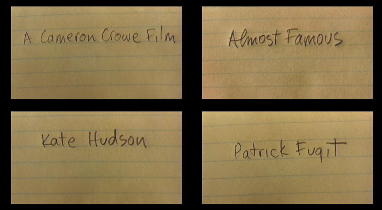
Two title sequences in particular inspire me all the time, even in this here blog. One is definitely already deemed a classic and the other will be considered that soon. Look up to the blog header or below - does that picture remind you of anything? Maybe there is a hint of a 15 year old rock loving enthusiast who does some writing for Rolling Stone?
Cameron Crowe's credits for Almost Famous were just asking to be paid homage to and I'm surely not the first to do it. [Click here to view the credits]
Only in the least year did I realize that Crowe, with his title card creation, seemed to have been initializing his own tip-o-the -hat to the credits of a beloved film and another one of my own personal favorites.
I knew there was a reason I was specifically drawn to both of these sequences!
Watching To Kill A Mockingbird last month I finally had the lightbulb moment about the similarities. Only last month! I've watched these both time and time again over the years, obsessed about the credits and only now saw the comparison.
The opening titles to Almost Famous and Mockingbird follow the hands of creative youth at work. They both exude that same feeling of the playful innocence we all had in our younger years. The two even specifically mirror each other in two instances, especially in how they honor treasured collections and looking back at memories.
One sequence shows a pile of childlike knickknacks saved in a tin box, where the other displays a drawer full of concert memorabilia (a right of passage for any teen). The closest similarity though, can be seen in the little girl rubbing a black crayon over her white paper to reveal the title of the movie and the hand of "the enemy" writing out the title of his movie on lined notebook paper.
These are great examples of how in just the opening credits the tone of the movie can already be set, with little bits of character traits and even some objects of each film creatively captured in one sequence.
Bad judgements can be negative, but anyone who judges these two movies by the first shot would be correct. Both films start strong and only get better.
When it became time to think about an update to the old blog design, it only seemed right to take inspiration from the other side of this honored duo. Maybe something like this:

Until next time.
Hey there, thanks for the follow - that way I found a great new blog too! Loving what I see already. Yes, the cover argument... it's a tough discussion. On one hand I agree on a philosophical level, on the other hand I just appreciate beauty so much that - and this is quite embarrassing - I sometimes find it hard to look at ugly people. I would like to change this and I'm trying to but it's hard! And the same goes for everything else from book to movie covers to guys. The cover matters - sadly, I guess.
ReplyDelete